

Goes
Making everyday delivery feel effortless Food delivery has become more than simply getting a meal from A to B. People expect convenience, speed, and access to the places they already know and love. Goes was created as a food and grocery delivery service in the UK, connecting people with some of the country’s most popular restaurants, stores, and markets through one simple experience. The challenge was to build a brand that could communicate this convenience while feeling energetic, approachable, and relevant to a modern audience. Goes needed an identity that could work across everything from a mobile app and delivery vehicles to packaging, digital platforms, and everyday customer interactions.
We developed a visual identity around the idea of movement and connection, bringing people closer to the food and places they love. The result is a flexible brand system designed to feel distinctive, recognizable, and easy to engage with across every touchpoint.
Region: United Kingdom
Services: Brand Strategy, Creative Direction, Brand Identity Design

Brand Strategy
Our proposition was ‘Food, Delivered Differently’; bringing Goes’s bold, energetic personality to life while reinforcing its promise of making great restaurant food feel closer, easier, and more exciting.


Brand Identity
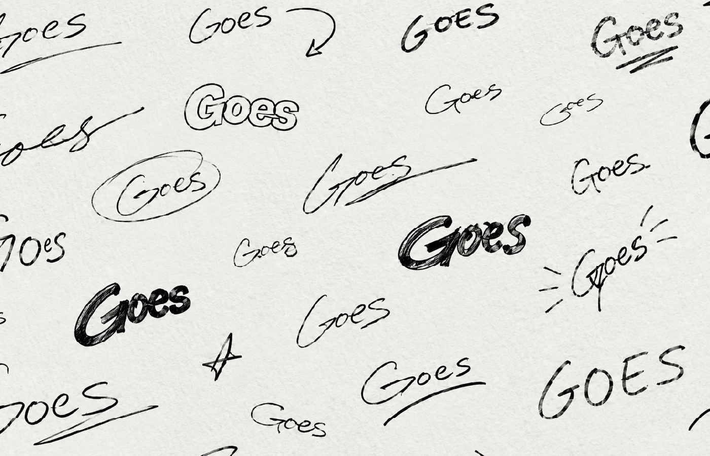
The Goes wordmark is at the heart of the brand identity. Rather than relying on a separate symbol, we use the distinctive shape and movement of the lettering itself as a visual asset. Its bold, energetic form translates naturally across every touchpoint, from delivery riders and bags to vehicles, packaging, and digital platforms. The expressive character of the wordmark also inspires a wider visual language of playful typography, hand-drawn lines, and dynamic compositions, creating consistency while keeping the brand active and instantly recognisable.


Brand Expression
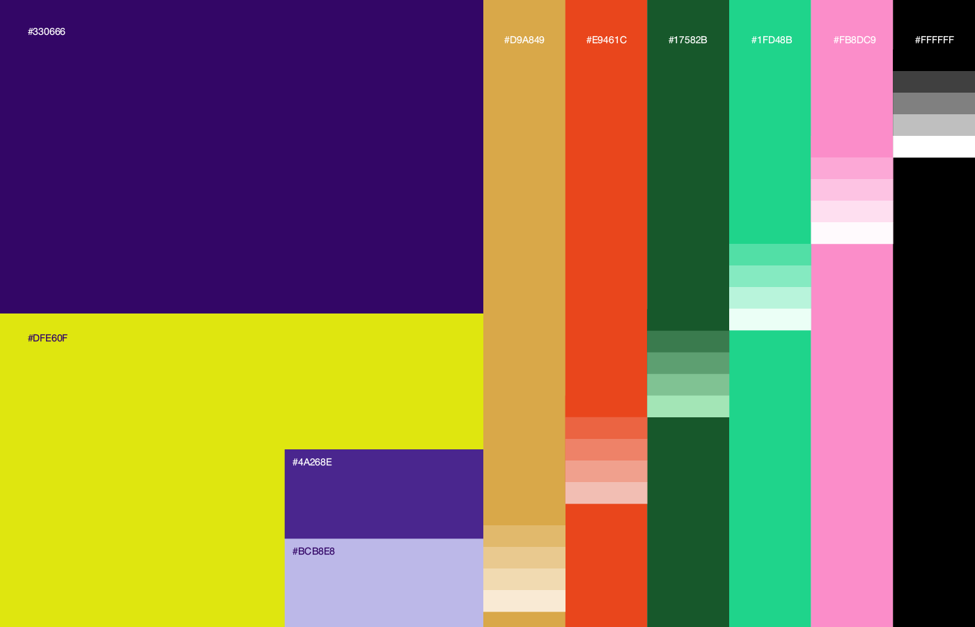
We created a bold and energetic brand that communicates movement, speed, and accessibility without relying on heavy copy. Instead, we built a distinctive visual language around the Goes wordmark, playful hand-drawn expressions, and vibrant purple and neon-lime colors. This flexible system allows the brand to feel recognizable across delivery riders, vehicles, packaging, and digital experiences while keeping the idea simple: Goes to your home.


Our vibrant purple and neon-lime colour palette brings the Goes identity to life across every rider touchpoint. The bold contrast gives riders strong visibility on the street, while the distinctive uniforms, delivery bags, and branded vehicles create a consistent presence wherever Goes travels. The same visual language extends into merchandise and digital applications, making every delivery a recognisable expression of the brand.


